- A logo that I really like is Hollister's logo. The red color of the bird really stands out from the dark background and the logo in general looks simple and bold (because of the font and colors).
- I like the SEASUN logo because the background and the logo match very well together. The logo overall looks very calm and relaxing. Also, the logo of the sun with lines makes it seem like the sun is actually setting in the water which relates to it's brand name seasun.

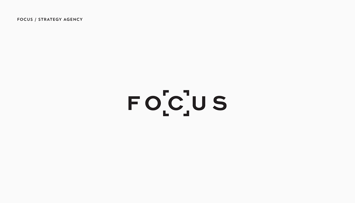
- I also liked the FOCUS logo because it is very simple and plain and it the box around the letter c really gets the audience to focus on the letter, which relates back to the word.
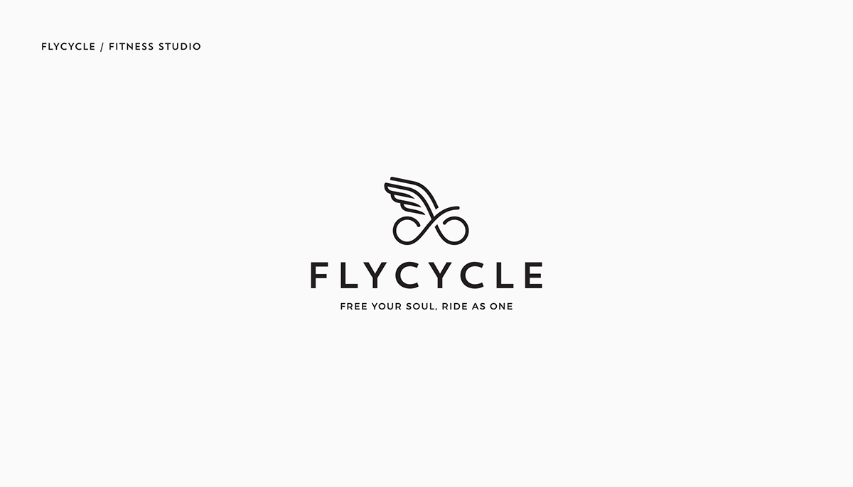
- Fly cycle's logo is another logo I like because it is cute and creative. Using the word fly cycle the logo shows two wheels connected to wings, which clearly conveys the company's name.
- I really like the turn logo because it is unique where the logo spells out turn when you look at it from the top or bottom. It conveys the word turn clearly and in a creative way.

- I like this logo because the logo uses a headphone plug to create the letters AM, it is very creative and the background matches the logo very well.
